TrailNest: Simplifying Shopping for Trekkers
Designing a seamless eCommerce experience for outdoor and trekking enthusiasts.
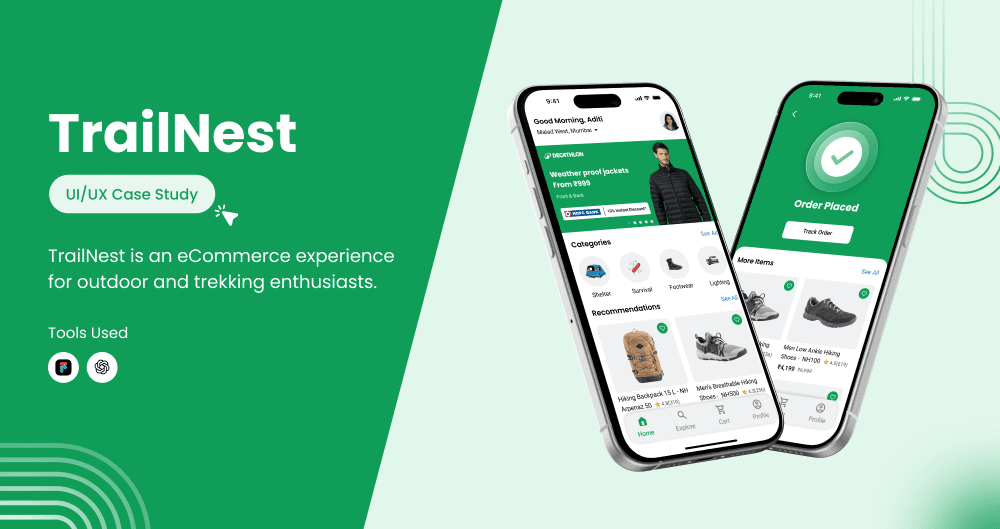
TrailNest
UI/UX Designer
E-commerce
Mobile(iOS)
Challenge
Trekkers often struggle with general eCommerce platforms due to cluttered layouts, limited filters, and unclear product details. This causes hesitation, low trust, and high cart abandonment. A dedicated platform was needed to improve clarity and user confidence.
Solution & Result
I launched TrailNest, a dedicated trekking gear platform featuring a clean, category-focused interface and immersive visuals. It’s projected to reduce cart abandonment by 30%, increase user confidence by 35%, and improve product discovery speed by 40%.
30%
Decrease in Cart Abandonment Rate
35%
Increase in user confidence
40%
Faster product discovery
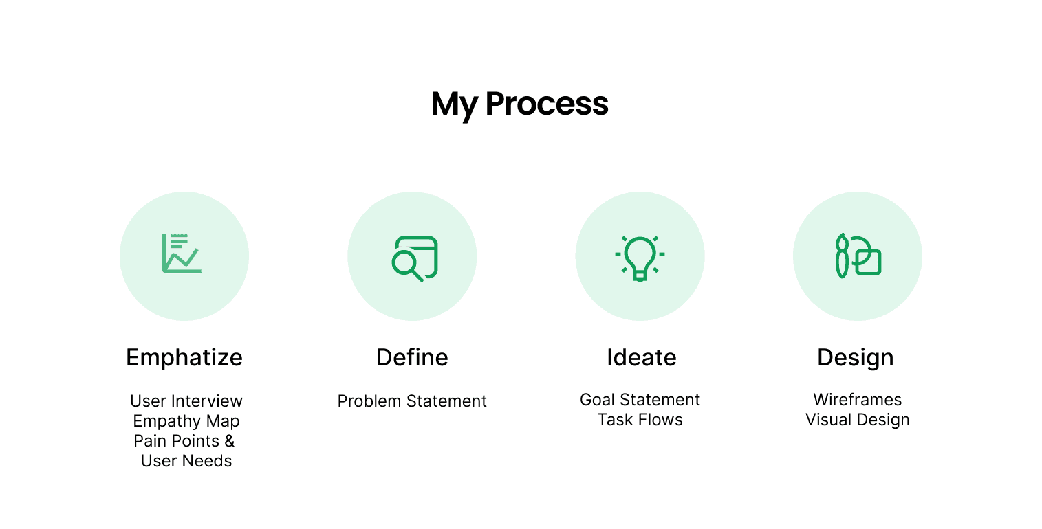
Empathize
Research Objective
To explore trekkers’ pain points while shopping online, understand their struggles with current eCommerce platforms, identify desired features, and evaluate their overall shopping experience.
Research
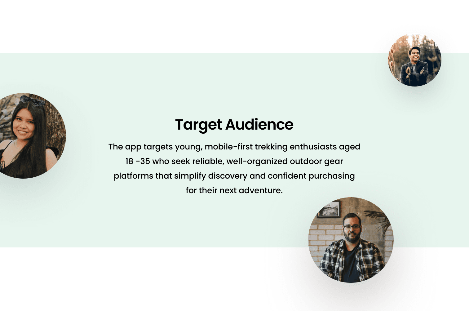
Target Audience
User Interview
I conducted 3 user interviews: one occasional, one beginner, and one experienced trekker.
These are the key insights from my user interviews:
Users feel overwhelmed by cluttered interfaces and too many irrelevant options.
There is a lack of trust due to unclear product descriptions and visuals.
Beginners want simpler language and guidance for selecting gear.
Experienced trekkers need detailed specs.
Users prefer curated categories tailored to trekking needs.
Wishlist functionality is important for planning future trips.
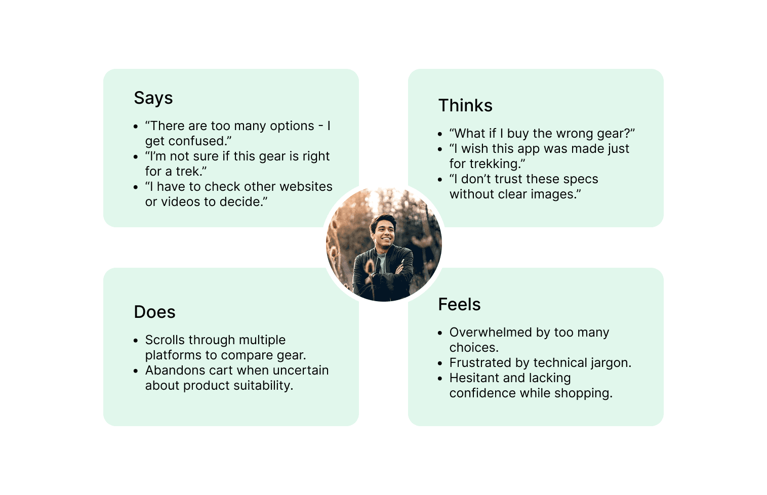
Empathy Map
I created one consolidated empathy map based on the interviews to identify shared behaviors and emotions. This helped me stay user-focused throughout the design process.
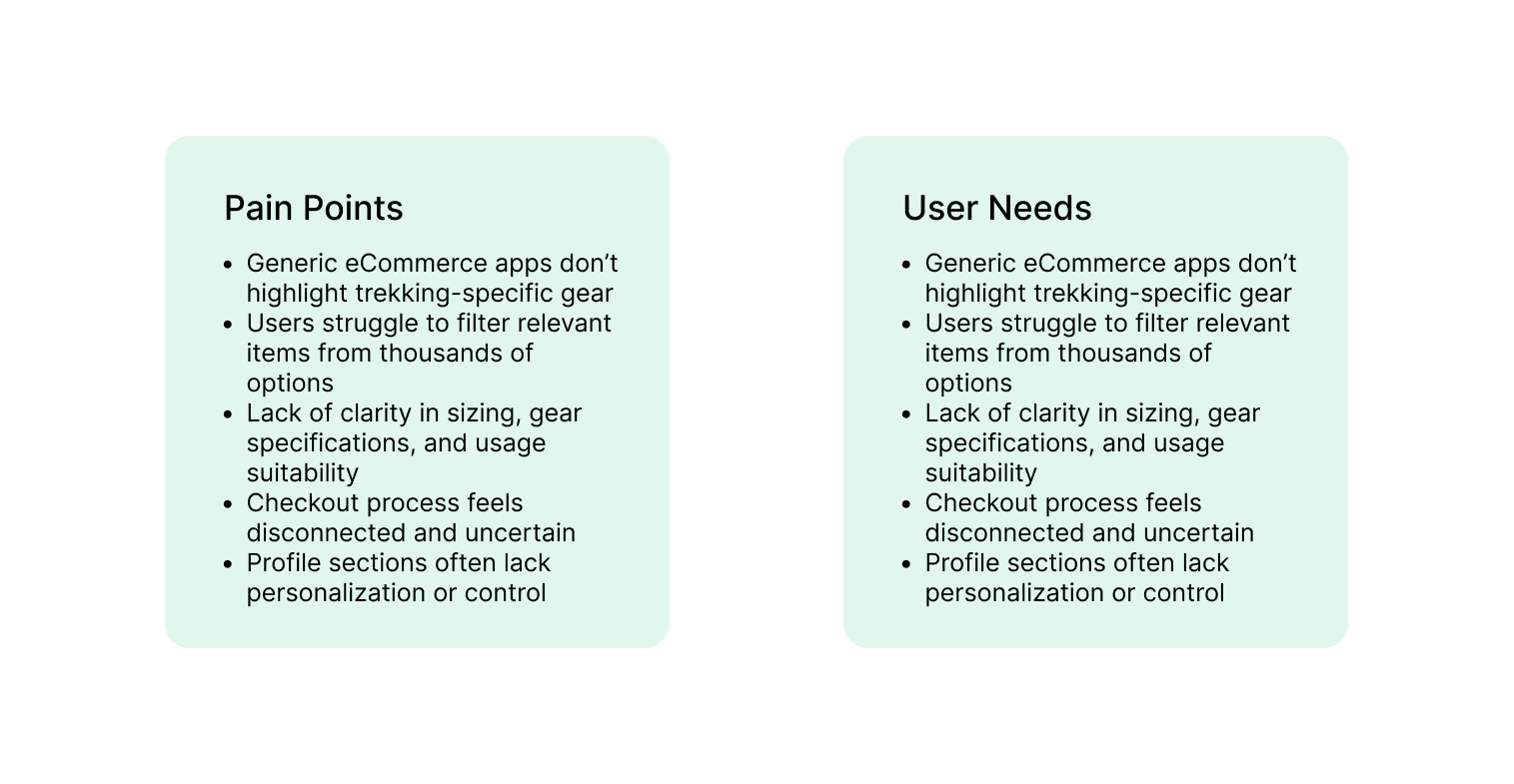
Pain Points & User Needs
After synthesizing the empathy map, I identified key pain points and user needs that guided my design decisions:
Research Conclustion
My research confirmed that trekkers face limited product variety, lack of context, and confusing navigation on generic platforms. The interviews and empathy map validated the need for a dedicated, visually focused trekking gear app.
Define
Ideate
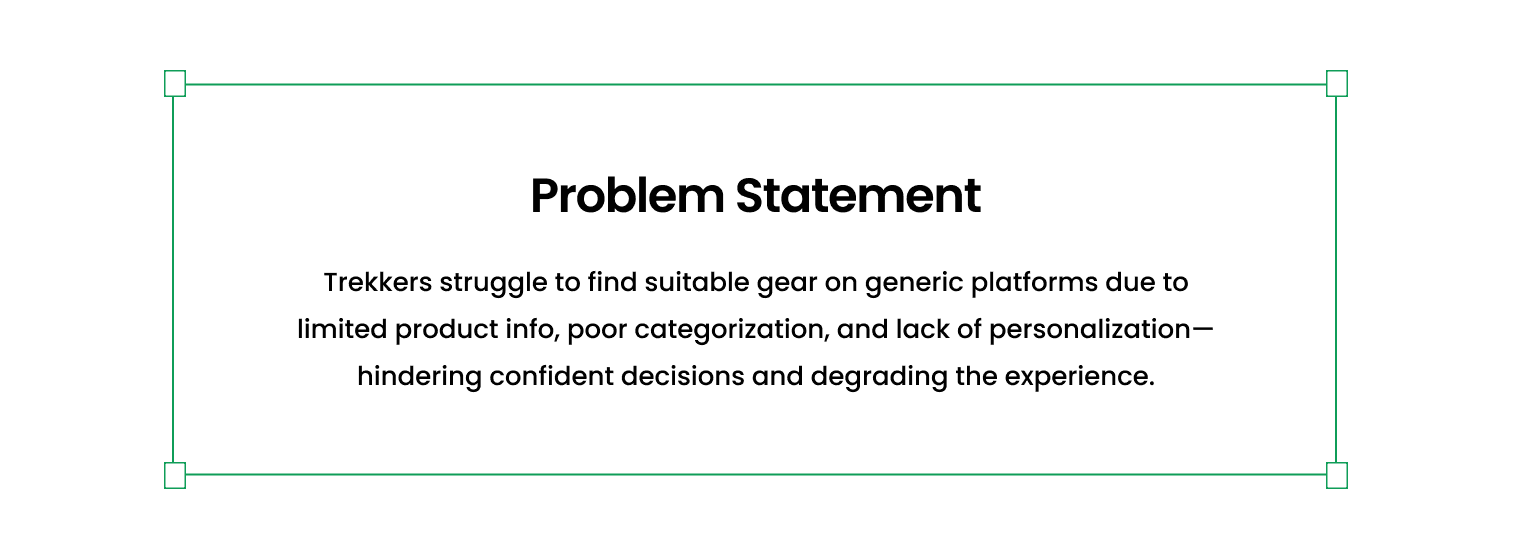
Goal Statement
Design a user-friendly, mobile-first eCommerce app tailored to trekkers that simplifies gear discovery, builds trust through clear visuals and categories, and helps users make confident purchases.
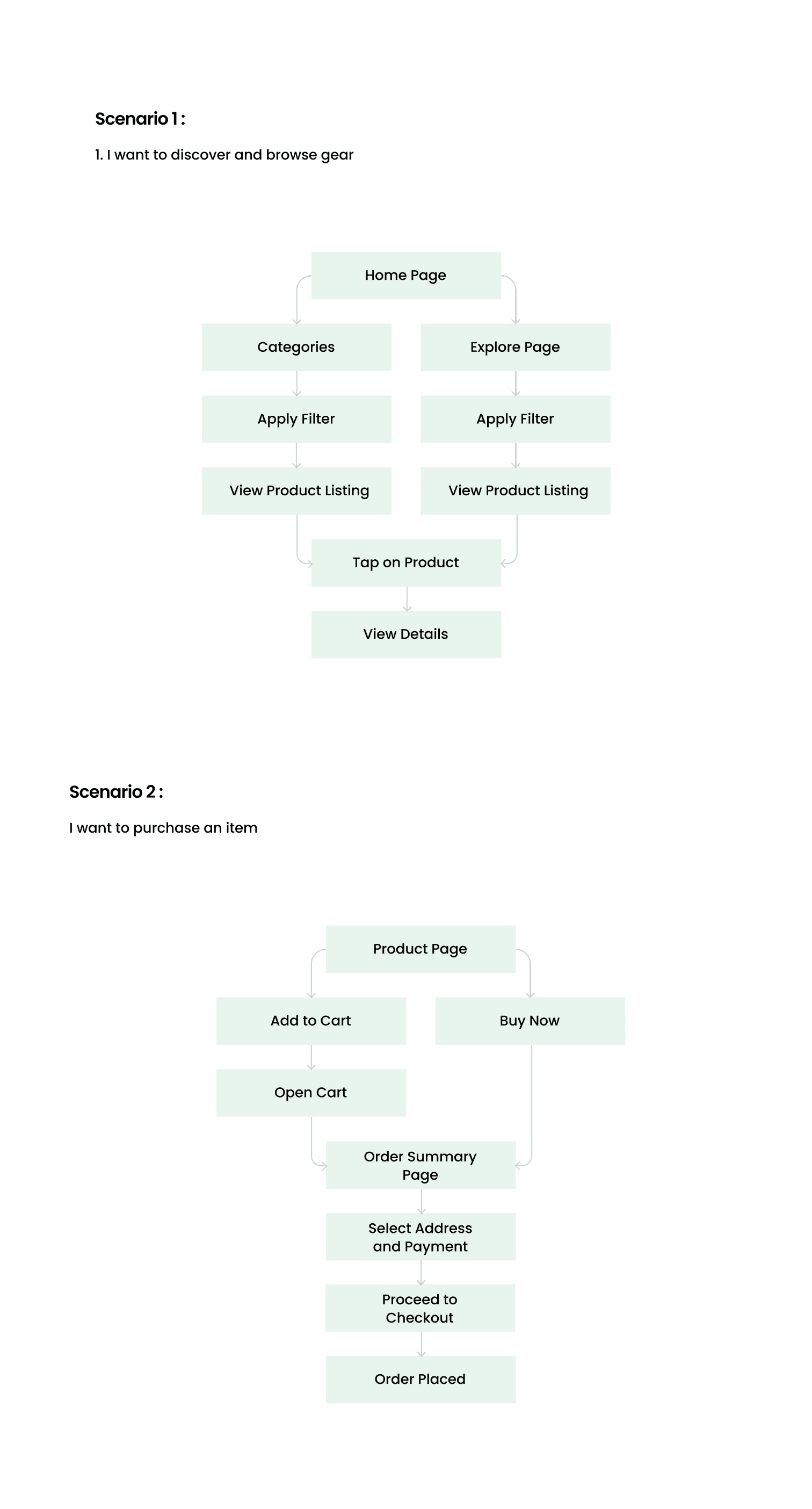
Taskflows
I created task flows for the most important user goals:
Design
Wireframe
I began with paper wireframes to quickly explore layouts and prioritize user actions. This allowed rapid iteration before focusing on high-fidelity visuals.
Style Guide
To ensure visual consistency, I created a style guide with typography, colors and spacing.
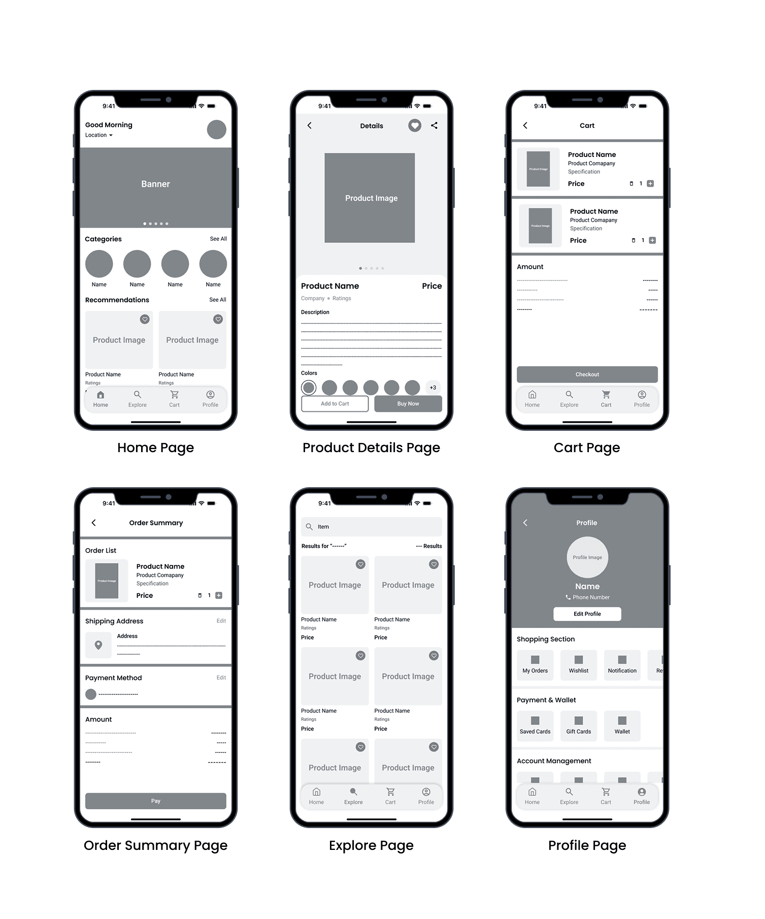
Screens
I translated the wireframes into final screens using the design system. These included onboarding, home, product details, cart, explore, profile and order summary page.
Design Rationale (with Annotations)
Conclusion
Outcome
TrailNest successfully addressed core user issues by offering a clean, intuitive, gear-specific eCommerce experience.
Scope of Improvement
While the app was well received, there is still room for growth:
Introduce product comparison for more informed decision-making.
Enhance personalization with AI-based recommendations.
Add a community or review section for more social trust.
Key Learnings
Talking to users early (even with just interviews) can unlock deeply relevant features.
Design systems helped maintain consistency and speed up iterations.
Focusing on niche user needs (like trekkers instead of general buyers) helped create a more targeted, valuable product.